Did the NBA Forget How to Make Good Jerseys?
Written by: Adrian Ramos and Daeshon Lawson
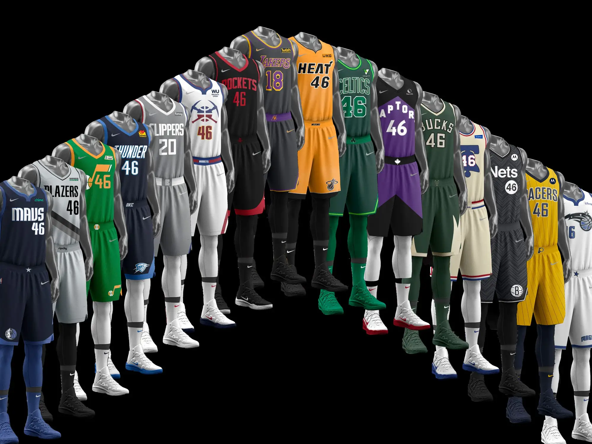
The 2023-2024 NBA season has arrived and so have the City Edition Jerseys for this year. They seem…uninspired?

When Nike took over jersey design in the summer of 2017, it introduced the concept of Association, Icon, and City Edition jerseys. “Association” and “Icon” are just home/away jerseys, we aren’t here to talk about that. The City Edition jerseys or alternates to put it in layman's terms aim to express the perspective of the city's culture and history through its NBA team. Seems like a perfect concept especially considering how impactful the NBA has been in its 77 years. When trying to depict a city through a bright and expressive uniform, what comes to mind? How hard can it be to depict NYC? The Mecca of basketball. Los Angeles? Beaches, Hollywood, stars, Kobe Bryant. Miami? Palm trees, vacation, warm weather, nightlife. Nike and the NBA have understood their mission and up until this year, executed it very well.
But In its 7 years in charge of designing NBA jerseys, Nike has already made some unforgettable jerseys.


Miami Heat Vice sports a teal and bright pink outline with both a black and white edition. Its a perfect depiction of Miami’s sunsets, nightlife, and beach life beautifully representing the city's culture on the court. The jersey was so good, that fans were calling for the team to make it their main uniform.
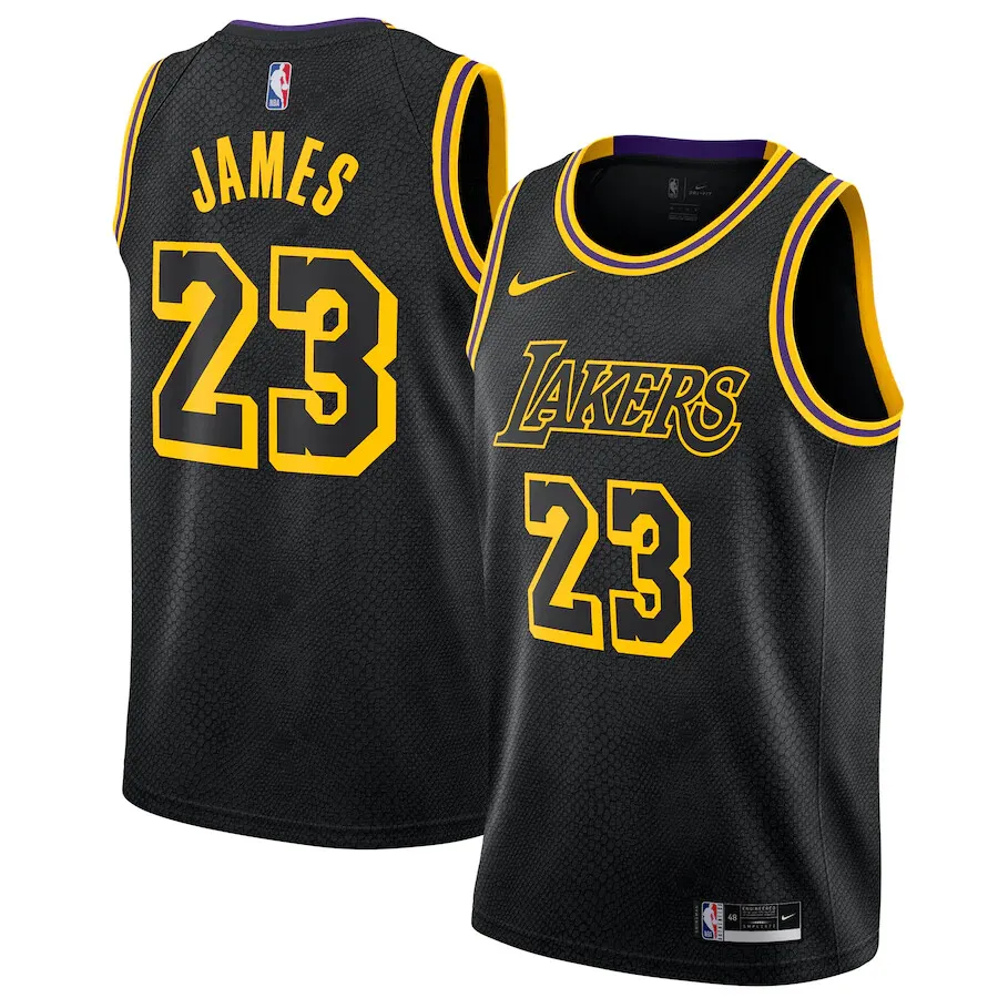

What about the Laker's black and gold snakeskin Mamba jersey? Regardless of who has and will play for the Lakers, who better to represent the franchise and its history of winning than The Black Mamba himself?

Or the Suns “The Valley” jersey? There have been a few iterations throughout the years, but the design generally reflects the city's bright sunsets and hills flawlessly. The mission is to depict the city and its history. How can you best show a Portland fan what the city of New Orleans is like while watching those teams battle?
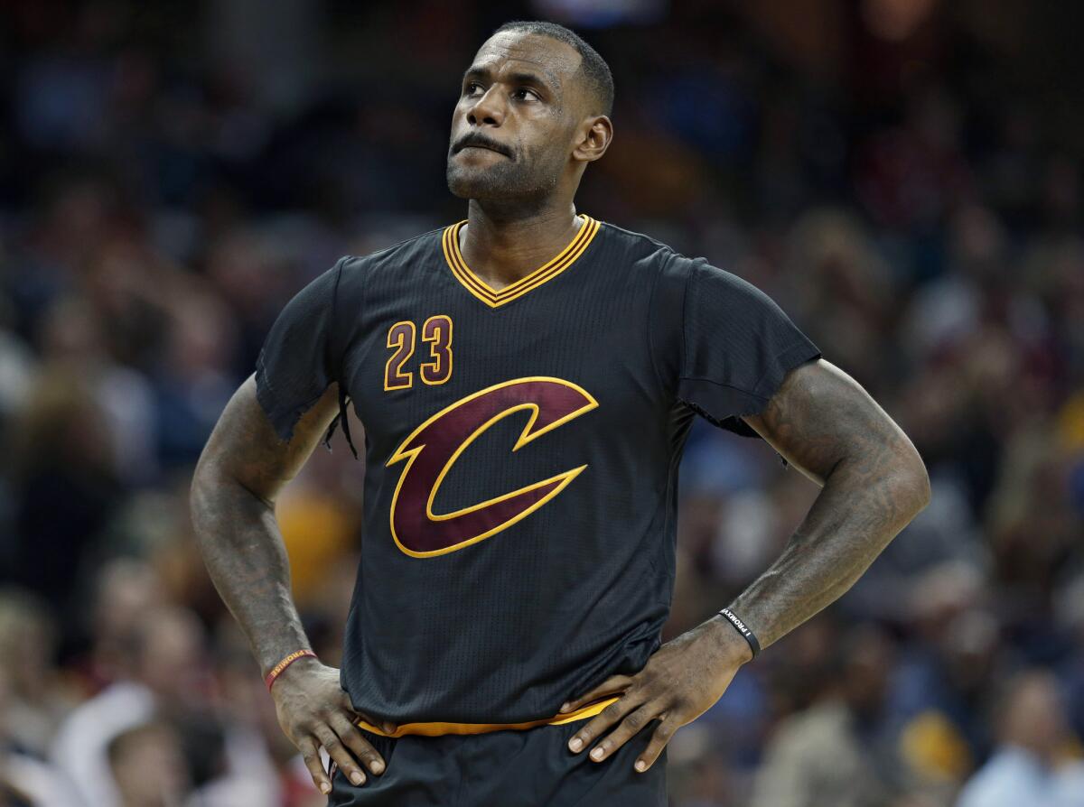
Before Nike, Adidas played heavily on the safe side but occasionally branched out and tried new ideas. Remember sleeved jerseys? For better or worse, Lebron fans definitely do. From James literally ripping the sleeves during a game, and getting a huge chase-down block on Andre Iguodala to bring his hometown its first NBA Championship (so goated). The black-sleeved jersey with a huge maroon C on the chest will be remembered forever.


From 2006 to 2017, Adidas was the NBA’s official apparel partner. Although there were a few notable jerseys under the Adidas umbrella, like the divisive Wizards gold jersey or the Pacers hickory jersey, which sported a shiny maroon jersey with bright yellow shorts, Adidas stayed pretty true to franchise's brand themes.
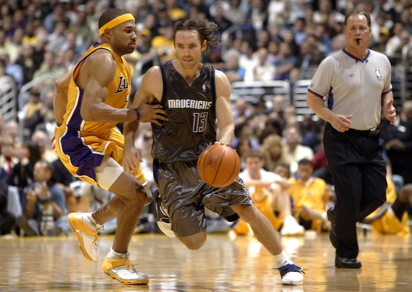
Shoutout to the Maverick’s brown Jerseys. Although controversial, this wasn’t a bad thing. Fans didn’t seem to complain. People bought their jerseys, represented their team and players, and went about their season.

Nike was no stranger to jerseys prior to joining forces with the NBA. They have been in charge of NFL apparel since 2012 where they introduced campaigns such as the Color rush jerseys for Thursday Night Football, which dressed teams in a mostly solid color uniform, so the idea of Nike taking over the NBA was nothing short of exciting. When the announcement was made it was thrilling to think of the possibilities.

In last year’s City Edition collection, there were some great highlights like Memphis's jersey which featured gold and diamonds to depict the city's hip-hop history, which fit with the fun and young team that was bringing an exciting spark to the city.

Some other great examples include Atlanta’s peach lining on a black jersey and the Spurs’ teal, pink, and orange call back to their Spurs Fiesta era that represented a upbeat walk down San Antonio's Riverwalk on a nice night with a cool breeze. At that point, it’s more about representing the city and not so much the team.

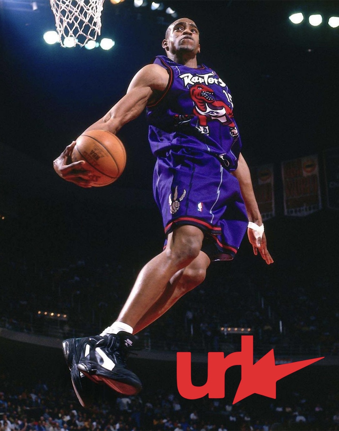
This year’s collection seems to have lost some of that fun behind representing the city and more about making a simple but clean design. Alternate jerseys need to go back to the days of having pine trees on the lining and a huge hawk across the chest. NBA alternates are supposed to be fun and expressive. The best jerseys are the most eye-catching ones. Bring back the teal Pistons horse logo, the rainbow Nuggets Mountain range, or even the big red raptor on an all-purple jersey. Or simply come up with new and exciting designs. Let the home and away jersey carry the simplicity while the alternate can just be fun and colorful.
Look, this isn’t to say Nike is fucking up or the NBA as a league needs to step in. The real culprit is oversaturation. Having to design 30 extra jerseys every year just isn’t feasible. In 2021, Nike released their “Earned It” collection. This collection awarded 16 teams an extra jersey if they made the playoffs. While this idea doesn’t change the fact that a new jersey is made every year, it gives teams a more focused and exciting reward for fans and players alike. I’m not sure if teams are too aware of this, but there’s nothing wrong with simply reusing a design. If it works, it works. The Utah Jazz did it with their Sunset jerseys and the Suns did it with their El Valle jerseys. Teams simply need to find an identity that works for fans and players alike and stick with it.
madeintheurl 2023