![]()
![]()
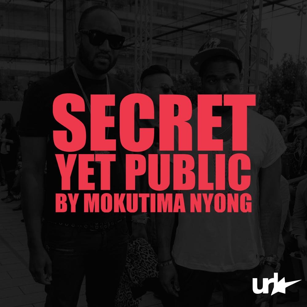
“secret-yet-public”
by Mokutima Nyong
IG | WEBSITE
I have forever been drawn to the idea of a creative person having these little “secret-yet-public” projects they undertake along their creative journey. When I say “secret-yet-public”, I mean that this is work that is out there in the public domain without clear attribution to the creator, yet their involvement becomes evident upon closer scrutiny. It’s not like they’re on a mountain-top screaming “Yoo! I had a hand in this, I did that” but if they’re directly asked, they wouldn’t deny their contribution.
Recently there was this Tom Ford article making the rounds among friends and close collaborators, revealing some intriguing “secret-yet-public” details. Among these were details about his brief tenure working with Marc Jacobs and his involvement in the inception of The Gucci Group (now Kering), the fashion conglomerate. In my opinion that’s some nice “secret-yet-public” info to know. There are people who know about this but I’m certain a lot of my generation have no idea that THE Tom Ford worked for Marc Jacobs at one point. Another little nice “secret-yet-public” nugget is that Steve Jobs purchased Lucasfilm’s Computer Division from George Lucas, the creator of Star Wars in 1986. He establishes it as the independent company we now know as “Pixar”, which then goes through various transformations and emerges as the beloved studio responsible for hits that defined our childhood like Toy Story, Finding Nemo, Monsters, Inc., Cars, Ratatouille, … the list goes on. It’s like, wth do you mean the iPhone guy was involved, like huh??
While scrolling through V’s tumblr page, I chanced upon a post dating back to October 2nd, 2010. Don’t ask me how I got that far, lol. Discovering such an impactful and culturally relevant “secret-yet-public” project that Virgil Abloh had a hand in, I just felt compelled to share this find.


“secret-yet-public”
by Mokutima Nyong
IG | WEBSITEI have forever been drawn to the idea of a creative person having these little “secret-yet-public” projects they undertake along their creative journey. When I say “secret-yet-public”, I mean that this is work that is out there in the public domain without clear attribution to the creator, yet their involvement becomes evident upon closer scrutiny. It’s not like they’re on a mountain-top screaming “Yoo! I had a hand in this, I did that” but if they’re directly asked, they wouldn’t deny their contribution.
Recently there was this Tom Ford article making the rounds among friends and close collaborators, revealing some intriguing “secret-yet-public” details. Among these were details about his brief tenure working with Marc Jacobs and his involvement in the inception of The Gucci Group (now Kering), the fashion conglomerate. In my opinion that’s some nice “secret-yet-public” info to know. There are people who know about this but I’m certain a lot of my generation have no idea that THE Tom Ford worked for Marc Jacobs at one point. Another little nice “secret-yet-public” nugget is that Steve Jobs purchased Lucasfilm’s Computer Division from George Lucas, the creator of Star Wars in 1986. He establishes it as the independent company we now know as “Pixar”, which then goes through various transformations and emerges as the beloved studio responsible for hits that defined our childhood like Toy Story, Finding Nemo, Monsters, Inc., Cars, Ratatouille, … the list goes on. It’s like, wth do you mean the iPhone guy was involved, like huh??
While scrolling through V’s tumblr page, I chanced upon a post dating back to October 2nd, 2010. Don’t ask me how I got that far, lol. Discovering such an impactful and culturally relevant “secret-yet-public” project that Virgil Abloh had a hand in, I just felt compelled to share this find.
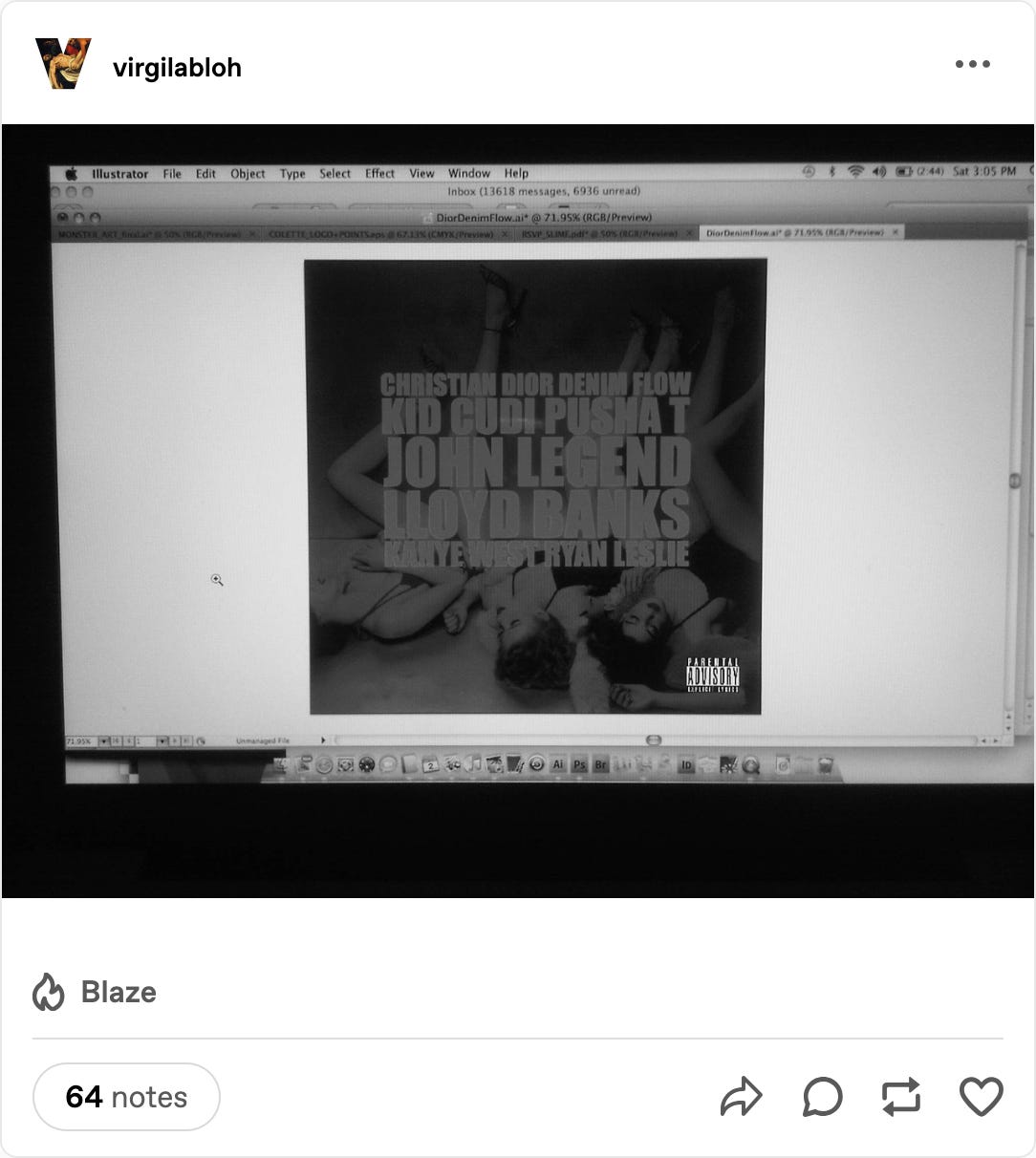
From Virgil Abloh’s Tumblr, October 2nd, 2010, 3:03 PM
First reaction was like “wdym Virgil is on Illustrator working on this cover??”, “Isn’t this one of the G.O.O.D Friday covers?”. The closer I looked into the image, I started noticing the tabs at the top of the program, I’m like “wdym 'DiorDenimFlow.ai'?”, “Is that 'MONSTER_ART_final.ai'??”. Continuing to scroll, I stumbled upon another post, and it starts to dawn on me that Virgil was indeed the designer behind the single covers for these era defining releases by Kanye West.

From Virgil Abloh’s Tumblr, October 16th, 2010, 11:15 AM
After the Hennessey-inspired incident involving Taylor Swift at the 2009 VMAs, Kanye went off the grid for a little over a year. Towards the tail end of the summer in 2010, he makes a comeback and revealed plans to release new songs every Friday leading up to the release of his fifth studio album, My Beautiful Dark Twisted Fantasy. Kanye cleverly dubbed these releases “G.O.O.D Friday”. He would give 14 songs away for free on his website. A 15th track—an unofficial official G.O.O.D Friday release, Christmas in Harlem dropped officially through iTunes, a few weeks after MBDTF hit the shelves just in time for Christmas. These songs are so good especially listening to them with 2024 ears, you can really tell this man had something to prove and was determined to make a lasting impression.
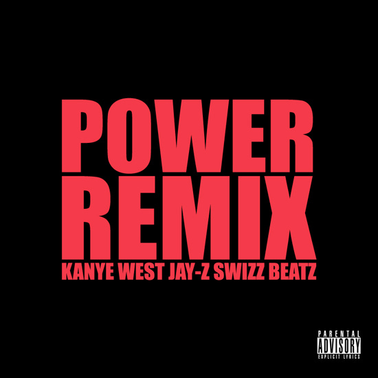
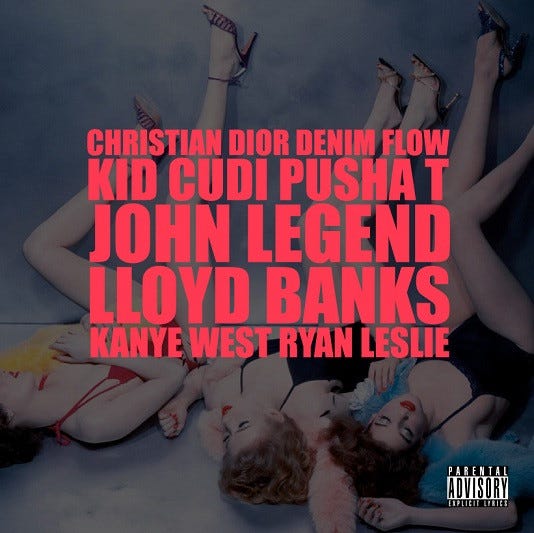
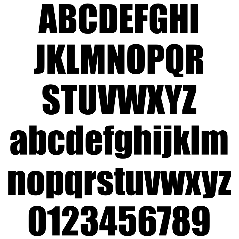
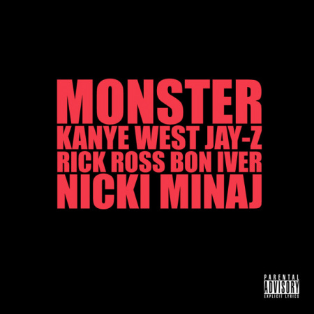
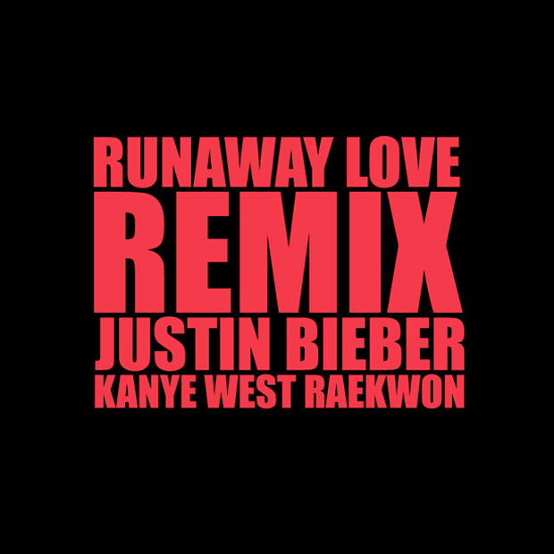
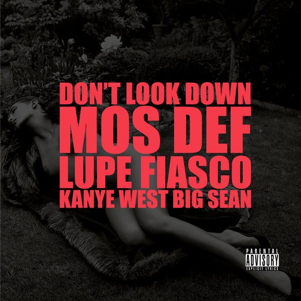
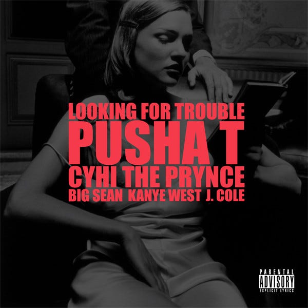
During that period, Virgil worked as the creative & art director for Mr. West, and his phenomenal design sensibilities were evident in the design of these cover arts. The covers for these songs began with minimalistic black backgrounds, presenting the song names and featured artist(s) in a bold, eye-catching red Impact font. It’s kinda ironic that Impact, as described in this beautiful paper I read on the font, “was designed to attract attention through the sheer power of its weight” which evidently it did here and coupled with the red colour there’s no way this didn’t command attention. I don’t know if Virgil thought about this in his design process but I sense the entire camp was strongly aligned. The weight of these releases was felt culturally, especially considering Kanye’s inclusion of heavyweight artists as features on most of the tracks. They undeniably made a lasting Impact 😉.

Impact Font Family designed by Geoffrey Lee and published by URW Type Foundry.
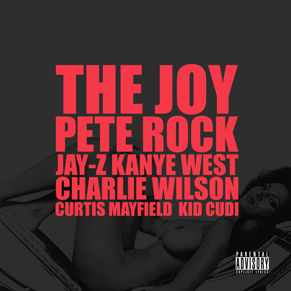
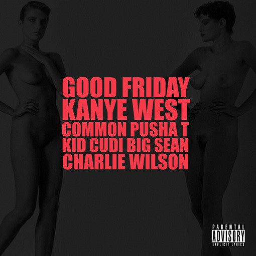
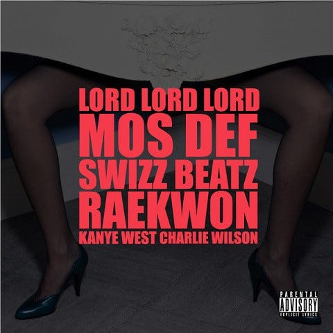
The text was centred and fully justified at the heart of the cover. Text sizes varied but were consistently in uppercase. The song titles appeared above the artists' names, positioned below them on the covers. Notably, all covers featured the “Parental Advisory” sticker, except for “Runaway Love Remix” & “Christmas in Harlem”.


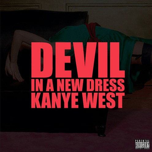
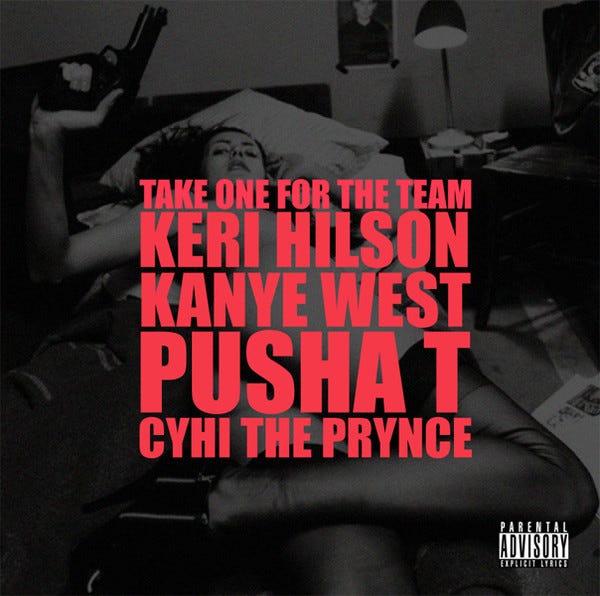
When the fourth week came around there was a subtle alteration in this approach, as Mr. Abloh began incorporating images overlaid with a black hue into the covers. The imagery predominantly focused on darker and more provocative themes, frequently featuring multiple depictions of women either nude or minimally clothed in suggestive poses.


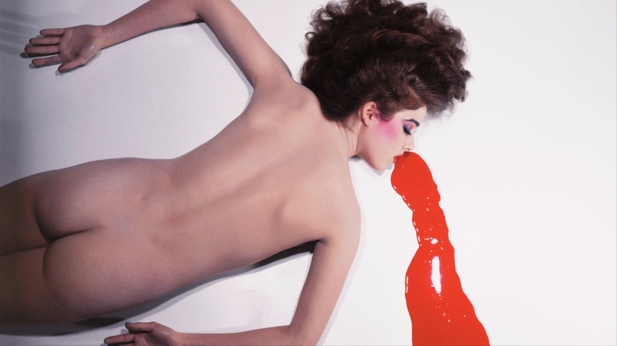
Their extensive artistic knowledge was on display through the utilization of a renowned photograph by French fashion photographer Guy Bourdin, featuring Nicolle Meyer in a naked and prone position beside a pool of vibrant, blood-red nail polish on Release no. 7, titled “So Appalled”.
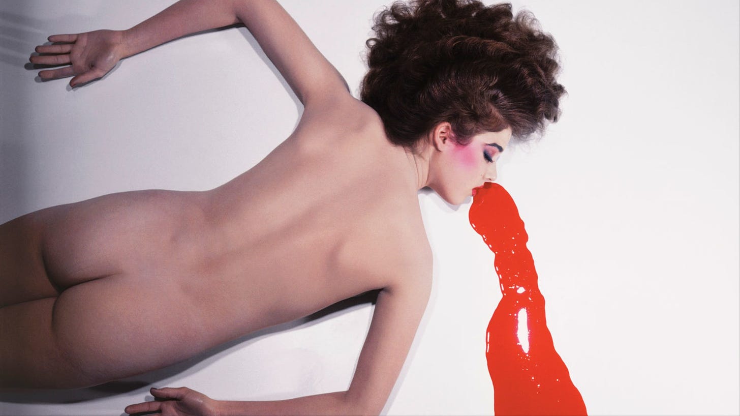 Nicolle Meyer shot by Guy Bourdin for his famous 1980 Pentax calendar

Breaking away from the established imagery, release no. 9 introduces an image depicting what I interpret as soldiers holding guns against a backdrop resembling an Italian plaster ceiling design.
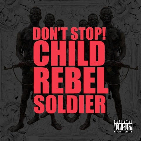
It’s back to business as usual.


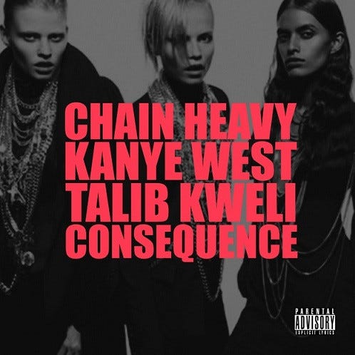
For the final two releases, Kanye and Virgil’s passion for fashion and art becomes evident. On the 14th release, the image behind the red text showcases a portion of Tisci’s Givenchy F/W 2008 Campaign, highlighting three of the four central women from the main campaign, all dressed in ensembles from that particular season and adorned with chains which perfectly aligns with the song’s theme. The collection was stunning, and I highly recommend looking at it. The incorporation of jewelry as an integral part of the looks truly made all the difference to me.
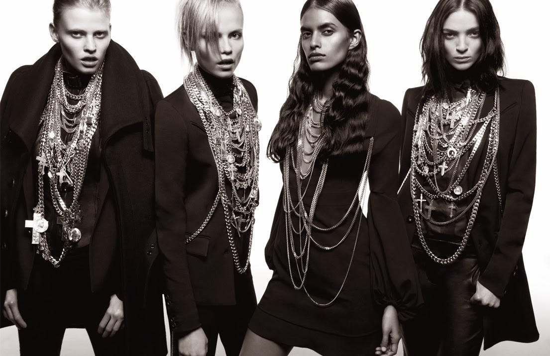 Givenchy F/W 2008 Campaign, Photographed by Inez Van Lamsweerde & Vinoodh Matadin
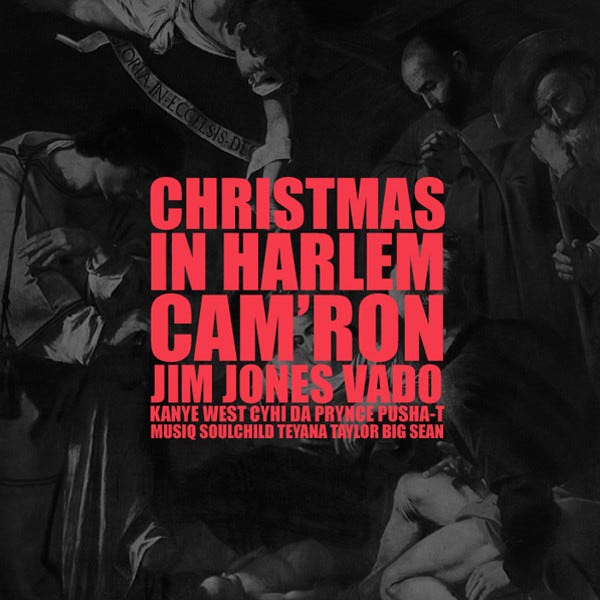
Regarding no. 15, “Christmas in Harlem” it seems Kanye let Virgil take the reigns on this one because he notably places a Caravaggio front and centre. I have no theories of why Virgil chose “Nativity with St. Francis and St. Lawrence, 1906”, aside from its portrayal of what I imagine might have occurred during the birth of Jesus—the essence of Christmas. Nonetheless, Virgil’s deep fondness for Caravaggio is well-known, as he has mentioned it several times, and it was a significant motif in his earlier brand, “Pyrex Vision” so it came as no surprise this was his choice.
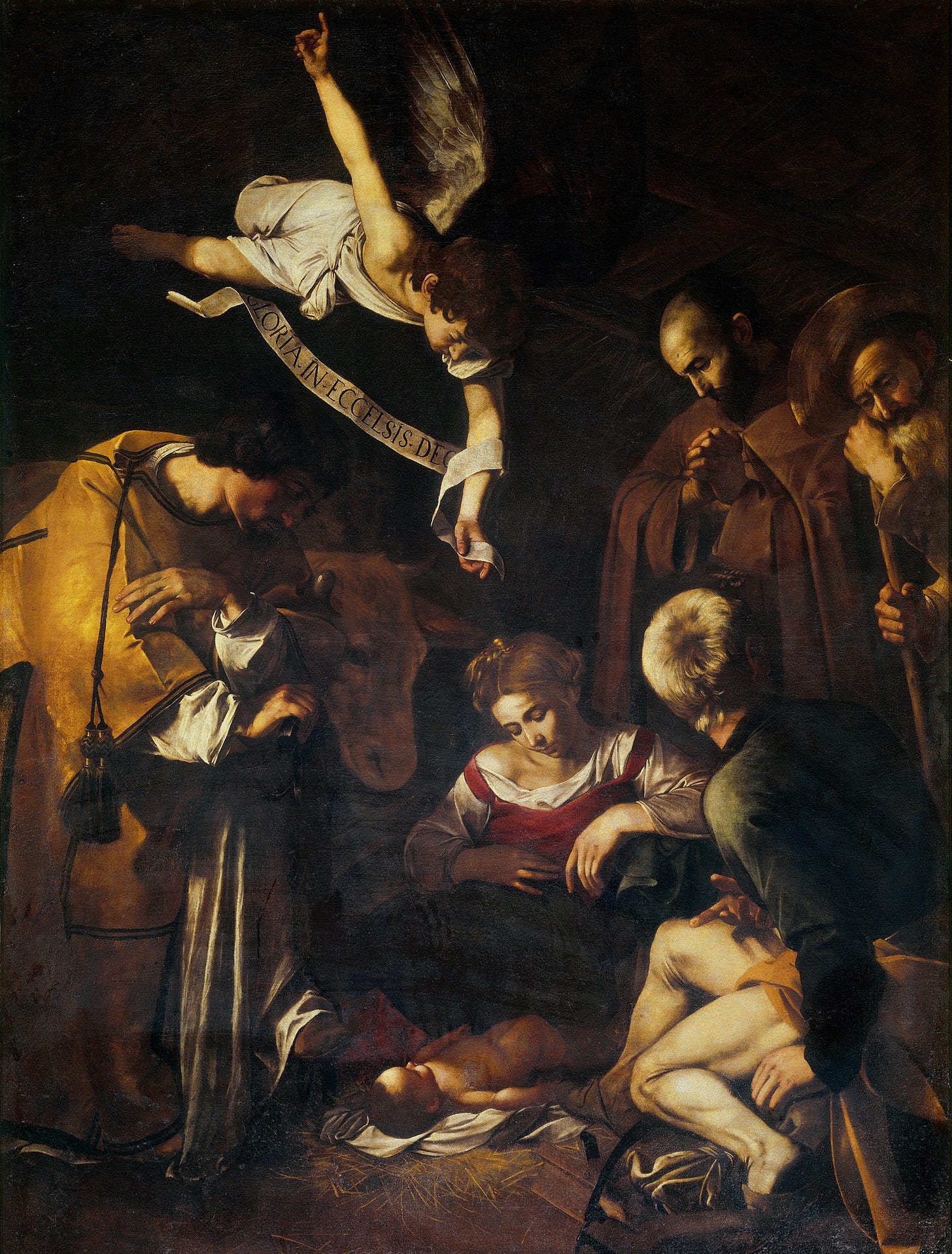
Nativity with St. Francis and St. Lawrence, Caravaggio, 1609
Coming across these works, what struck me was the cohesion and uniformity of the design language across these covers. To my mind, even as standalone releases, I could see these songs and visuals living on an album. It is also very easy to imagine what an album cover for these songs in album format would look like with (releases 4 - 15) or without images (releases 1 - 3) incorporated.
In my research to write this piece, I found a blog post from September 20, 2010 which said “Check your Twitter feed and you’ll see many avatars either swiping them or using them as inspiration. And of course, would be MCs are jacking them wholesale for their own work.” This, to me, reinforced the immense impact these covers had during that time. I wish there had been more media coverage about them then. Without a doubt, these covers definitely defined an era.
It appears that a majority of those familiar with this era are well-acquainted with these covers and their significance in the realm of fans and music during that period. Yet, many might not have known about Virgil’s involvement in their creation. While the primary spotlight understandably falls on the music, I think the cultural significance wouldn't be as potent without the covers. I sensed a need for a thorough examination of the covers from a design standpoint, and hence, here it is.
Virgil’s cultural influence through his designs predates his fame in the fashion world, a truly inspiring feat at a time when his name wasn't widely recognized.
The journey through Virgil Abloh’s “secret-yet-public” involvement in the covers of the G.O.O.D Friday releases unveils a hidden layer of cultural significance. From the impactful simplicity of the initial designs to the intriguing evolution involving renowned artworks, each cover reflects a meticulous thought process and an artistic depth that transcends mere visuals.
These “secret-yet-public” works speak volumes about the interconnectedness of creativity and culture, showcasing how subtle, concealed contributions contribute to broader artistic movements. They symbolize the undercurrents of influence, often unseen but immensely impactful. They mirror the concealed dynamics steering social evolution, challenging norms, and paving unconventional paths. Just as creativity silently molds cultural narratives, these projects silently contribute to reshaping social perceptions and initiating shifts in collective perspectives.
In essence, “secret-yet-public” projects prompt us to reevaluate the narratives of creative contributions, urging a deeper understanding of the layers woven into our cultural fabric. They remind us that within the subtlety of concealed endeavours lies a wealth of cultural and social significance, deserving recognition and celebration in the broader spectrum of human expression.
Listen to G.O.O.D Friday.
Hope you all have a great week,
Happy New Year:)
Originally written on my Substack
madeintheurl 2024
First reaction was like “wdym Virgil is on Illustrator working on this cover??”, “Isn’t this one of the G.O.O.D Friday covers?”. The closer I looked into the image, I started noticing the tabs at the top of the program, I’m like “wdym 'DiorDenimFlow.ai'?”, “Is that 'MONSTER_ART_final.ai'??”. Continuing to scroll, I stumbled upon another post, and it starts to dawn on me that Virgil was indeed the designer behind the single covers for these era defining releases by Kanye West.
From Virgil Abloh’s Tumblr, October 16th, 2010, 11:15 AM
After the Hennessey-inspired incident involving Taylor Swift at the 2009 VMAs, Kanye went off the grid for a little over a year. Towards the tail end of the summer in 2010, he makes a comeback and revealed plans to release new songs every Friday leading up to the release of his fifth studio album, My Beautiful Dark Twisted Fantasy. Kanye cleverly dubbed these releases “G.O.O.D Friday”. He would give 14 songs away for free on his website. A 15th track—an unofficial official G.O.O.D Friday release, Christmas in Harlem dropped officially through iTunes, a few weeks after MBDTF hit the shelves just in time for Christmas. These songs are so good especially listening to them with 2024 ears, you can really tell this man had something to prove and was determined to make a lasting impression.
During that period, Virgil worked as the creative & art director for Mr. West, and his phenomenal design sensibilities were evident in the design of these cover arts. The covers for these songs began with minimalistic black backgrounds, presenting the song names and featured artist(s) in a bold, eye-catching red Impact font. It’s kinda ironic that Impact, as described in this beautiful paper I read on the font, “was designed to attract attention through the sheer power of its weight” which evidently it did here and coupled with the red colour there’s no way this didn’t command attention. I don’t know if Virgil thought about this in his design process but I sense the entire camp was strongly aligned. The weight of these releases was felt culturally, especially considering Kanye’s inclusion of heavyweight artists as features on most of the tracks. They undeniably made a lasting Impact 😉.
Impact Font Family designed by Geoffrey Lee and published by URW Type Foundry.
The text was centred and fully justified at the heart of the cover. Text sizes varied but were consistently in uppercase. The song titles appeared above the artists' names, positioned below them on the covers. Notably, all covers featured the “Parental Advisory” sticker, except for “Runaway Love Remix” & “Christmas in Harlem”.
When the fourth week came around there was a subtle alteration in this approach, as Mr. Abloh began incorporating images overlaid with a black hue into the covers. The imagery predominantly focused on darker and more provocative themes, frequently featuring multiple depictions of women either nude or minimally clothed in suggestive poses.
Their extensive artistic knowledge was on display through the utilization of a renowned photograph by French fashion photographer Guy Bourdin, featuring Nicolle Meyer in a naked and prone position beside a pool of vibrant, blood-red nail polish on Release no. 7, titled “So Appalled”.
Nicolle Meyer shot by Guy Bourdin for his famous 1980 Pentax calendar
Breaking away from the established imagery, release no. 9 introduces an image depicting what I interpret as soldiers holding guns against a backdrop resembling an Italian plaster ceiling design.
It’s back to business as usual.
For the final two releases, Kanye and Virgil’s passion for fashion and art becomes evident. On the 14th release, the image behind the red text showcases a portion of Tisci’s Givenchy F/W 2008 Campaign, highlighting three of the four central women from the main campaign, all dressed in ensembles from that particular season and adorned with chains which perfectly aligns with the song’s theme. The collection was stunning, and I highly recommend looking at it. The incorporation of jewelry as an integral part of the looks truly made all the difference to me.
Givenchy F/W 2008 Campaign, Photographed by Inez Van Lamsweerde & Vinoodh Matadin
Regarding no. 15, “Christmas in Harlem” it seems Kanye let Virgil take the reigns on this one because he notably places a Caravaggio front and centre. I have no theories of why Virgil chose “Nativity with St. Francis and St. Lawrence, 1906”, aside from its portrayal of what I imagine might have occurred during the birth of Jesus—the essence of Christmas. Nonetheless, Virgil’s deep fondness for Caravaggio is well-known, as he has mentioned it several times, and it was a significant motif in his earlier brand, “Pyrex Vision” so it came as no surprise this was his choice.
Nativity with St. Francis and St. Lawrence, Caravaggio, 1609
Coming across these works, what struck me was the cohesion and uniformity of the design language across these covers. To my mind, even as standalone releases, I could see these songs and visuals living on an album. It is also very easy to imagine what an album cover for these songs in album format would look like with (releases 4 - 15) or without images (releases 1 - 3) incorporated.
In my research to write this piece, I found a blog post from September 20, 2010 which said “Check your Twitter feed and you’ll see many avatars either swiping them or using them as inspiration. And of course, would be MCs are jacking them wholesale for their own work.” This, to me, reinforced the immense impact these covers had during that time. I wish there had been more media coverage about them then. Without a doubt, these covers definitely defined an era.
It appears that a majority of those familiar with this era are well-acquainted with these covers and their significance in the realm of fans and music during that period. Yet, many might not have known about Virgil’s involvement in their creation. While the primary spotlight understandably falls on the music, I think the cultural significance wouldn't be as potent without the covers. I sensed a need for a thorough examination of the covers from a design standpoint, and hence, here it is.
Virgil’s cultural influence through his designs predates his fame in the fashion world, a truly inspiring feat at a time when his name wasn't widely recognized.
The journey through Virgil Abloh’s “secret-yet-public” involvement in the covers of the G.O.O.D Friday releases unveils a hidden layer of cultural significance. From the impactful simplicity of the initial designs to the intriguing evolution involving renowned artworks, each cover reflects a meticulous thought process and an artistic depth that transcends mere visuals.
These “secret-yet-public” works speak volumes about the interconnectedness of creativity and culture, showcasing how subtle, concealed contributions contribute to broader artistic movements. They symbolize the undercurrents of influence, often unseen but immensely impactful. They mirror the concealed dynamics steering social evolution, challenging norms, and paving unconventional paths. Just as creativity silently molds cultural narratives, these projects silently contribute to reshaping social perceptions and initiating shifts in collective perspectives.
In essence, “secret-yet-public” projects prompt us to reevaluate the narratives of creative contributions, urging a deeper understanding of the layers woven into our cultural fabric. They remind us that within the subtlety of concealed endeavours lies a wealth of cultural and social significance, deserving recognition and celebration in the broader spectrum of human expression.
Listen to G.O.O.D Friday.
Hope you all have a great week,
Happy New Year:)
Originally written on my Substack 
From Virgil Abloh’s Tumblr, October 16th, 2010, 11:15 AM
After the Hennessey-inspired incident involving Taylor Swift at the 2009 VMAs, Kanye went off the grid for a little over a year. Towards the tail end of the summer in 2010, he makes a comeback and revealed plans to release new songs every Friday leading up to the release of his fifth studio album, My Beautiful Dark Twisted Fantasy. Kanye cleverly dubbed these releases “G.O.O.D Friday”. He would give 14 songs away for free on his website. A 15th track—an unofficial official G.O.O.D Friday release, Christmas in Harlem dropped officially through iTunes, a few weeks after MBDTF hit the shelves just in time for Christmas. These songs are so good especially listening to them with 2024 ears, you can really tell this man had something to prove and was determined to make a lasting impression.
During that period, Virgil worked as the creative & art director for Mr. West, and his phenomenal design sensibilities were evident in the design of these cover arts. The covers for these songs began with minimalistic black backgrounds, presenting the song names and featured artist(s) in a bold, eye-catching red Impact font. It’s kinda ironic that Impact, as described in this beautiful paper I read on the font, “was designed to attract attention through the sheer power of its weight” which evidently it did here and coupled with the red colour there’s no way this didn’t command attention. I don’t know if Virgil thought about this in his design process but I sense the entire camp was strongly aligned. The weight of these releases was felt culturally, especially considering Kanye’s inclusion of heavyweight artists as features on most of the tracks. They undeniably made a lasting Impact 😉.
Impact Font Family designed by Geoffrey Lee and published by URW Type Foundry.
The text was centred and fully justified at the heart of the cover. Text sizes varied but were consistently in uppercase. The song titles appeared above the artists' names, positioned below them on the covers. Notably, all covers featured the “Parental Advisory” sticker, except for “Runaway Love Remix” & “Christmas in Harlem”.

When the fourth week came around there was a subtle alteration in this approach, as Mr. Abloh began incorporating images overlaid with a black hue into the covers. The imagery predominantly focused on darker and more provocative themes, frequently featuring multiple depictions of women either nude or minimally clothed in suggestive poses.

Their extensive artistic knowledge was on display through the utilization of a renowned photograph by French fashion photographer Guy Bourdin, featuring Nicolle Meyer in a naked and prone position beside a pool of vibrant, blood-red nail polish on Release no. 7, titled “So Appalled”.
 Nicolle Meyer shot by Guy Bourdin for his famous 1980 Pentax calendar
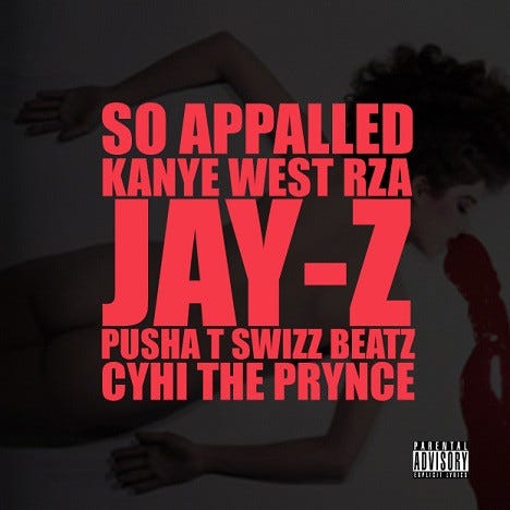

Breaking away from the established imagery, release no. 9 introduces an image depicting what I interpret as soldiers holding guns against a backdrop resembling an Italian plaster ceiling design.

It’s back to business as usual.


For the final two releases, Kanye and Virgil’s passion for fashion and art becomes evident. On the 14th release, the image behind the red text showcases a portion of Tisci’s Givenchy F/W 2008 Campaign, highlighting three of the four central women from the main campaign, all dressed in ensembles from that particular season and adorned with chains which perfectly aligns with the song’s theme. The collection was stunning, and I highly recommend looking at it. The incorporation of jewelry as an integral part of the looks truly made all the difference to me.
Givenchy F/W 2008 Campaign, Photographed by Inez Van Lamsweerde & Vinoodh Matadin
Regarding no. 15, “Christmas in Harlem” it seems Kanye let Virgil take the reigns on this one because he notably places a Caravaggio front and centre. I have no theories of why Virgil chose “Nativity with St. Francis and St. Lawrence, 1906”, aside from its portrayal of what I imagine might have occurred during the birth of Jesus—the essence of Christmas. Nonetheless, Virgil’s deep fondness for Caravaggio is well-known, as he has mentioned it several times, and it was a significant motif in his earlier brand, “Pyrex Vision” so it came as no surprise this was his choice.
Nativity with St. Francis and St. Lawrence, Caravaggio, 1609
Coming across these works, what struck me was the cohesion and uniformity of the design language across these covers. To my mind, even as standalone releases, I could see these songs and visuals living on an album. It is also very easy to imagine what an album cover for these songs in album format would look like with (releases 4 - 15) or without images (releases 1 - 3) incorporated.
In my research to write this piece, I found a blog post from September 20, 2010 which said “Check your Twitter feed and you’ll see many avatars either swiping them or using them as inspiration. And of course, would be MCs are jacking them wholesale for their own work.” This, to me, reinforced the immense impact these covers had during that time. I wish there had been more media coverage about them then. Without a doubt, these covers definitely defined an era.
It appears that a majority of those familiar with this era are well-acquainted with these covers and their significance in the realm of fans and music during that period. Yet, many might not have known about Virgil’s involvement in their creation. While the primary spotlight understandably falls on the music, I think the cultural significance wouldn't be as potent without the covers. I sensed a need for a thorough examination of the covers from a design standpoint, and hence, here it is.
Virgil’s cultural influence through his designs predates his fame in the fashion world, a truly inspiring feat at a time when his name wasn't widely recognized.
The journey through Virgil Abloh’s “secret-yet-public” involvement in the covers of the G.O.O.D Friday releases unveils a hidden layer of cultural significance. From the impactful simplicity of the initial designs to the intriguing evolution involving renowned artworks, each cover reflects a meticulous thought process and an artistic depth that transcends mere visuals.
These “secret-yet-public” works speak volumes about the interconnectedness of creativity and culture, showcasing how subtle, concealed contributions contribute to broader artistic movements. They symbolize the undercurrents of influence, often unseen but immensely impactful. They mirror the concealed dynamics steering social evolution, challenging norms, and paving unconventional paths. Just as creativity silently molds cultural narratives, these projects silently contribute to reshaping social perceptions and initiating shifts in collective perspectives.
In essence, “secret-yet-public” projects prompt us to reevaluate the narratives of creative contributions, urging a deeper understanding of the layers woven into our cultural fabric. They remind us that within the subtlety of concealed endeavours lies a wealth of cultural and social significance, deserving recognition and celebration in the broader spectrum of human expression.
Listen to G.O.O.D Friday.
Hope you all have a great week,
Happy New Year:)
madeintheurl 2024